
Last Updated: September 2025
Your living room is the heart of your home, and choosing the right modern living room color palettes can transform this essential space from ordinary to extraordinary. Whether you’re planning a complete makeover or simply refreshing your current design, the perfect color scheme sets the foundation for everything else.
In today’s design landscape, modern living room color palettes blend contemporary trends with timeless appeal. Gone are the days when white walls were your only “safe” option. Today’s homeowners are embracing bold jewel tones, sophisticated earthy neutrals, and unexpected color combinations that reflect their personality while maintaining broad appeal.
This comprehensive guide explores the most effective color strategies for modern living spaces, backed by design psychology research and real-world application insights. You’ll discover how to create cohesive schemes that work with your lifestyle, natural light, and existing furnishings.
Understanding Color Psychology in Modern Living Spaces
Color profoundly impacts our mood and behavior. Research from the University of Rochester reveals that certain colors can actually influence our energy levels and emotional well-being. When selecting modern living room color palettes, understanding these psychological effects becomes crucial.
Warm colors like terracotta and dusty rose create intimate, cozy atmospheres perfect for relaxation and conversation. Cool tones such as sage green and soft blues promote tranquility and focus. Neutral palettes provide versatility and longevity, making them ideal for homeowners who frequently update accessories and artwork.
The key lies in balancing these effects with your personal preferences and the room’s primary functions. A family room that hosts game nights might benefit from energizing warm tones, while a formal living space could shine with sophisticated cool neutrals.
Top 8 Modern Living Room Color Palettes
1. Earthy Neutrals: The Foundation Palette
The earthy neutrals living room palette represents the gold standard of modern design. This sophisticated approach combines warm beiges, mushroom grays, and soft taupes to create spaces that feel both contemporary and timeless.
Key Colors:
- Benjamin Moore’s “Revere Pewter” (HC-172)
- Sherwin Williams’ “Accessible Beige” (SW 7036)
- Clare’s “Current Mood”
This palette works exceptionally well with natural materials like jute rugs, wooden coffee tables, and linen upholstery. The Amazon bestseller Loloi Magnolia Home Rug in Ivory/Multi perfectly complements this color scheme, adding texture without overwhelming the neutral foundation.
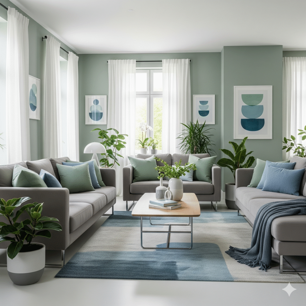
2. Sage Green: Nature’s Modern Touch
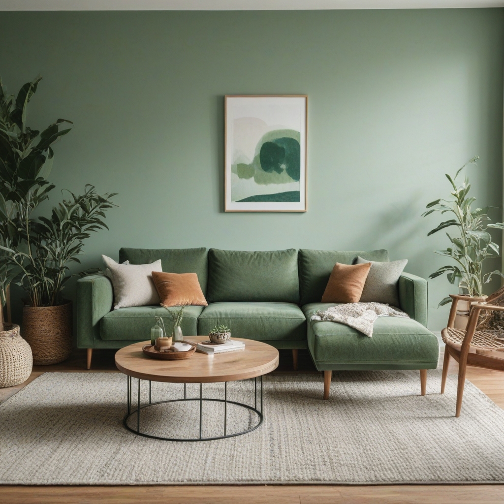
Sage green modern living room colors have emerged as a favorite among interior designers and homeowners alike. This versatile hue bridges the gap between bold and neutral, offering enough personality to make a statement while remaining sophisticated enough for long-term enjoyment.
Implementation Tips:
- Use sage as an accent wall color
- Incorporate through large furniture pieces like sectional sofas
- Balance with cream or warm white trim
The Rivet Revolve Modern Upholstered Sofa in Sage from Amazon exemplifies how this color can anchor a modern living space while maintaining comfort and style.
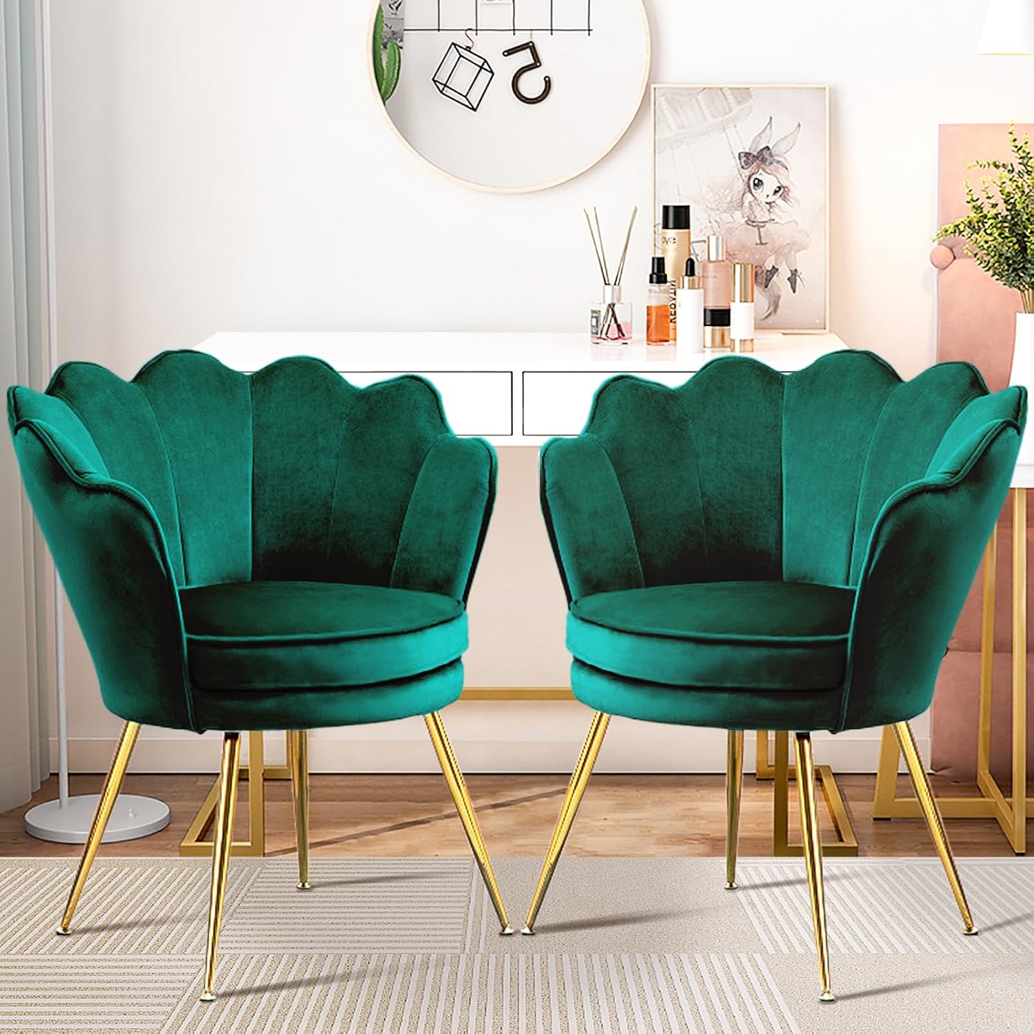
3. Jewel Tone Sophistication
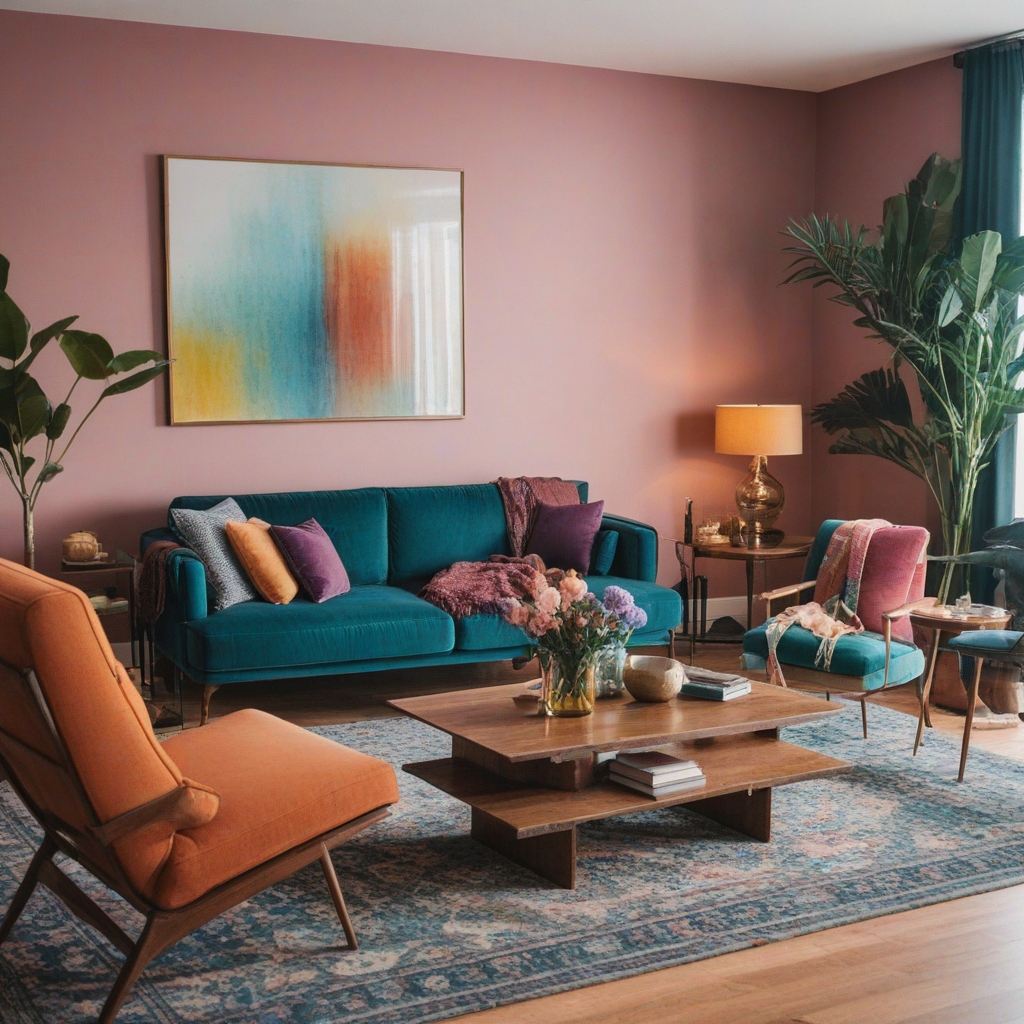
For homeowners ready to embrace drama, a jewel tone color palette modern living room delivers unmatched elegance. Deep emeralds, sapphire blues, and rich burgundies create spaces that feel luxurious and intentional.
Color Combination Examples:
- Emerald green + gold accents + cream
- Navy blue + brass fixtures + white
- Deep plum + rose gold + light gray
These bold choices require careful balance. The Rivet Mid-Century Modern Velvet Accent Chair in Emerald shows how a single jewel-toned piece can elevate an entire room without overwhelming the space.
4. Dusty Rose Eleganc
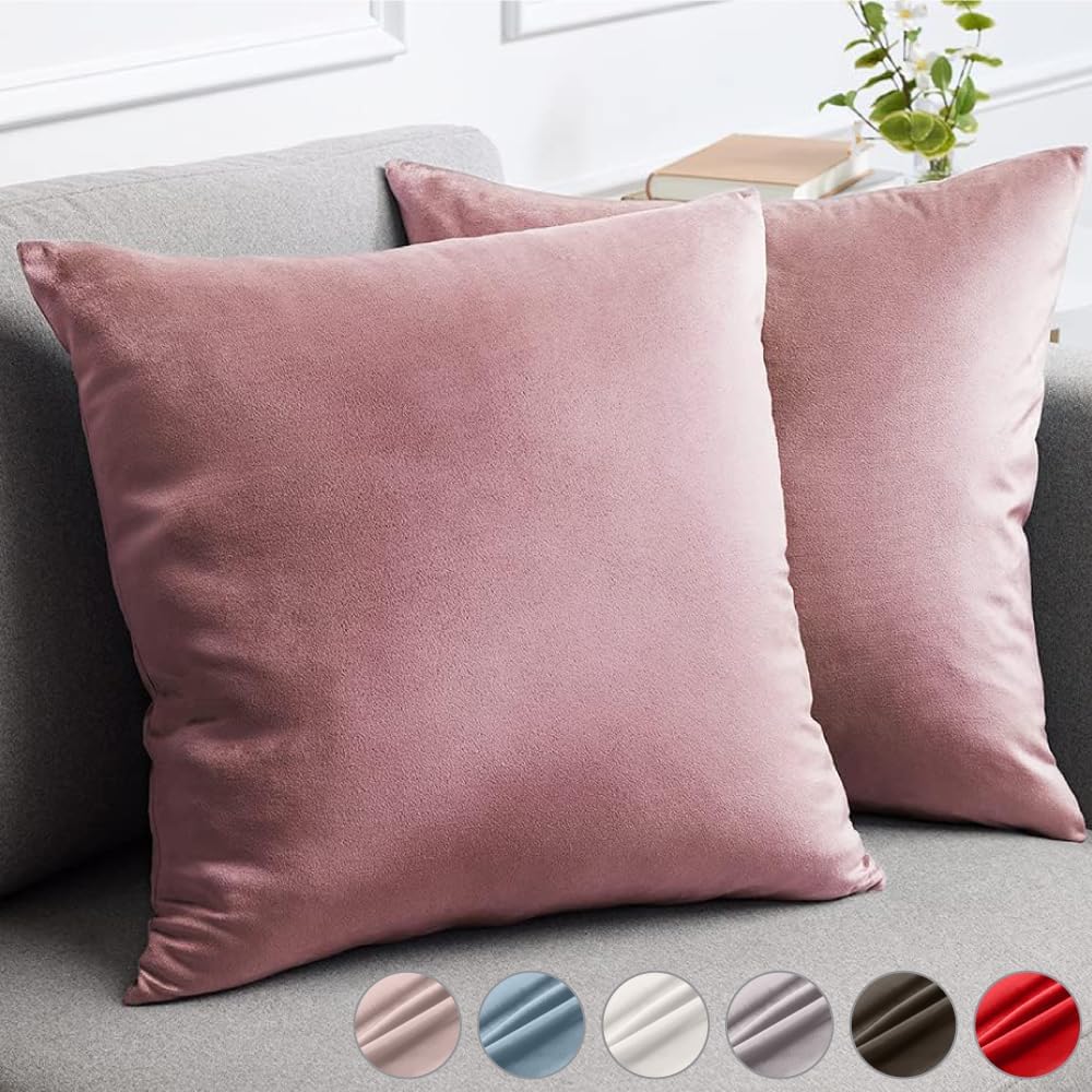
Dusty rose for living room schemes offers a fresh alternative to traditional pink palettes. This muted, sophisticated shade works beautifully in modern contexts, especially when paired with complementary neutrals.
Perfect Pairings:
- Dusty rose + charcoal gray + white
- Blush tones + sage green + cream
- Rose + navy + gold accents
The trending West Elm Inspired Throw Pillows in Dusty Rose demonstrate how this color can be introduced gradually through accessories before committing to larger applications.
5. Monochromatic Gray Schemes
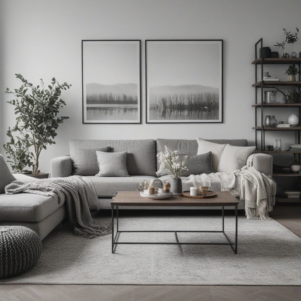
Modern neutral color palettes for living rooms often center around sophisticated gray schemes. From light dove gray to dramatic charcoal, this versatile color family creates cohesive, calming environments.
Gray Palette Variations:
- Light grays for small spaces
- Medium grays for balanced contrast
- Dark grays for dramatic impact
6. Black and White Contemporary
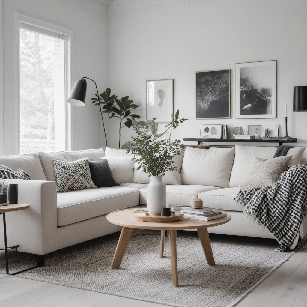
The classic black and white combination gets a modern update through strategic use of texture and metallic accents. This high-contrast approach works particularly well in minimalist and Scandinavian-inspired designs.
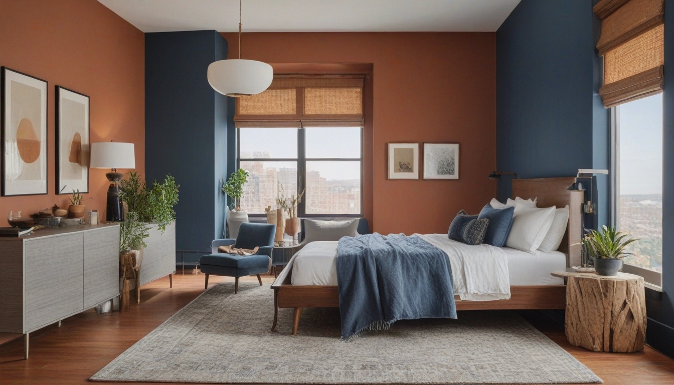
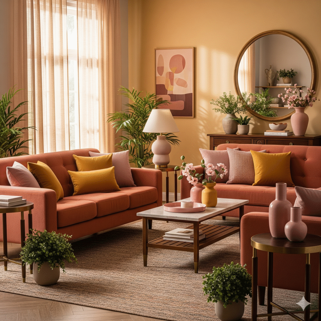
7. Warm Terracotta and Clay
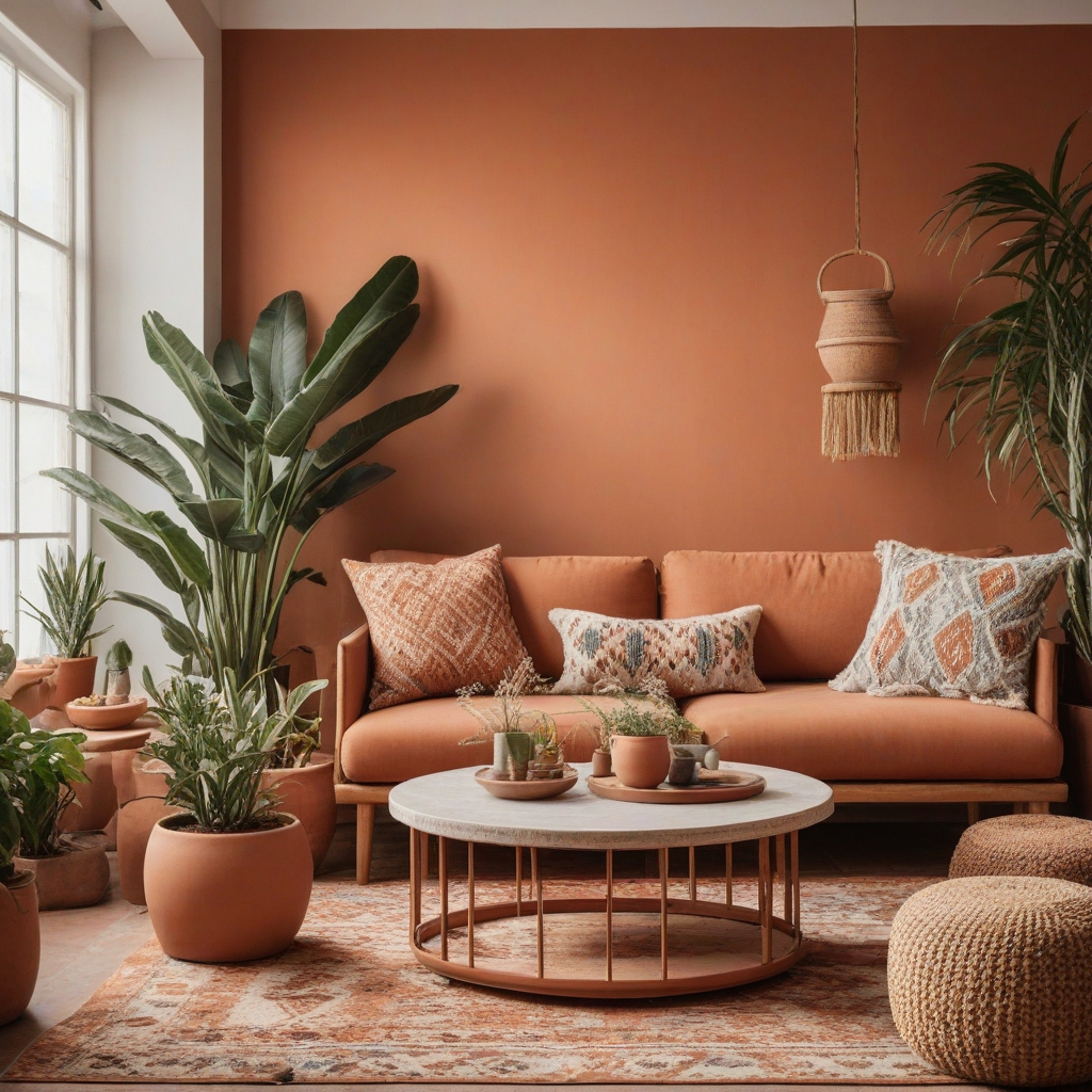
Inspired by southwestern design trends, terracotta-based palettes bring warmth and earthiness to modern living spaces. These colors pair beautifully with natural materials and plants.
8. Muted Metallics and Soft Pastels
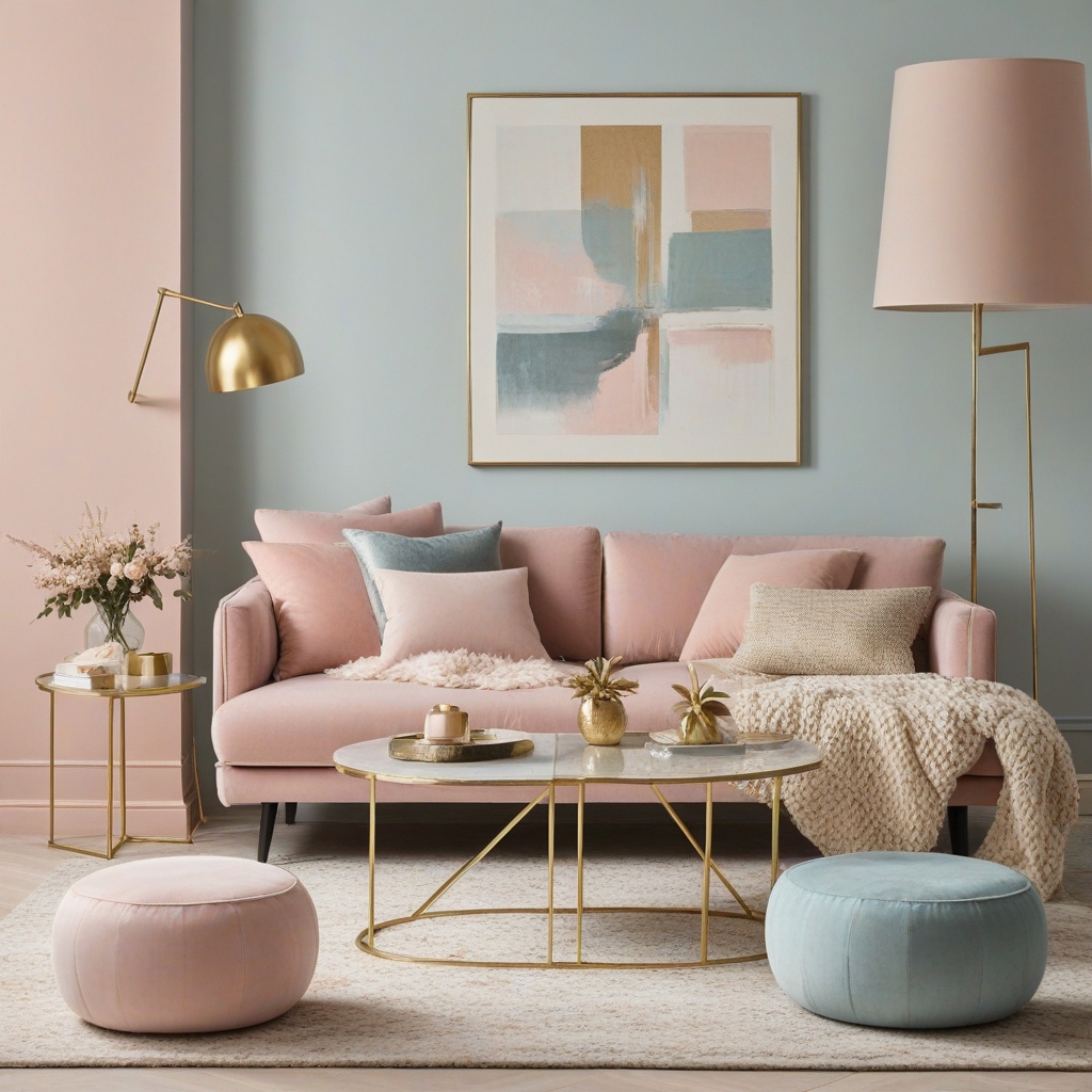
Muted metallic accents living room palettes combine subtle shimmer with gentle pastels for a sophisticated, contemporary feel. Think brushed gold with soft pink, or aged brass with pale blue.
Best Living Room Color Schemes: A Comparative Analysis
Warm vs. Cool Palettes
Warm Palettes (Terracotta, Dusty Rose, Golden Neutrals):
- Pros: Create intimacy, work well with natural light, timeless appeal
- Cons: Can feel overwhelming in small spaces, may clash with cool-toned furniture
- Best For: North-facing rooms, family gathering spaces, traditional home styles
Cool Palettes (Sage Green, Blues, Cool Grays):
- Pros: Promote relaxation, make spaces feel larger, work with modern furnishings
- Cons: Can feel cold without warm accents, may lack personality
- Best For: South-facing rooms, home offices, contemporary architecture
Bold vs. Neutral Approaches
Bold Color Schemes:
- Higher visual impact but require more careful planning
- May date more quickly than neutral alternatives
- Perfect for confident decorators and statement-making spaces
Neutral Schemes:
- Offer flexibility and longevity
- Easier to accessorize and update seasonally
- Ideal for resale value and timeless appeal
Living Room Paint Colors Modern: Professional Tips
Choosing the Right Finish
The paint finish affects both appearance and durability. For living room paint colors modern applications, consider these options:
- Eggshell: Subtle sheen, easy to clean, hides minor imperfections
- Satin: More durable, better for high-traffic areas
- Matte: Sophisticated appearance, best for low-traffic walls
Testing Colors in Your Space
Never commit to a color based solely on a paint chip. Purchase sample sizes and test colors on multiple walls at different times of day. Natural light changes throughout the day, and your chosen shade should look appealing in both morning sunlight and evening lamplight.
Coordinating with Existing Elements
Consider your room’s permanent features when selecting modern living room color palettes:
- Flooring materials and colors
- Built-in cabinetry or architectural details
- Large furniture pieces you plan to keep
- Natural light exposure and window treatments
How to Choose a Color Palette for a Living Room: Step-by-Step Guide
Step 1: Assess Your Space and Lighting
Natural light dramatically affects color perception. North-facing rooms receive cooler light and benefit from warm color palettes, while south-facing spaces can handle cooler tones beautifully.
Step 2: Define Your Style Goals
Are you aiming for cozy and intimate, or bright and airy? Your answer will guide color temperature choices and saturation levels.
Step 3: Consider Your Lifestyle
Families with young children might prioritize washable, forgiving colors, while empty nesters can experiment with more delicate or dramatic options.
Step 4: Start with a Focal Point
Choose one element—artwork, a rug, or a statement furniture piece—and build your palette around its colors.
Step 5: Follow the 60-30-10 Rule
- 60% dominant color (usually walls)
- 30% secondary color (furniture, curtains)
- 10% accent color (pillows, artwork, accessories)
What Are the Best Modern Living Room Colors? Expert Insights
According to the National Association of Home Builders’ latest trends report, the most popular modern living room color palettes include:
- Warm Neutrals (32% of respondents)
- Sage and Forest Greens (28% of respondents)
- Navy and Deep Blues (24% of respondents)
- Earthy Terracottas (16% of respondents)
Sherwin-Williams’ 2025 Color of the Year, “Upward,” reflects this trend toward optimistic, nature-inspired hues that promote well-being and connection.
Budget-Friendly Implementation Strategies
DIY vs. Professional Installation
DIY Approach:
- More affordable upfront costs
- Complete control over timing and process
- Great for accent walls and small spaces
Professional Installation:
- Expert color matching and application
- Time-saving for large projects
- Better results for complex techniques
Gradual Color Introduction
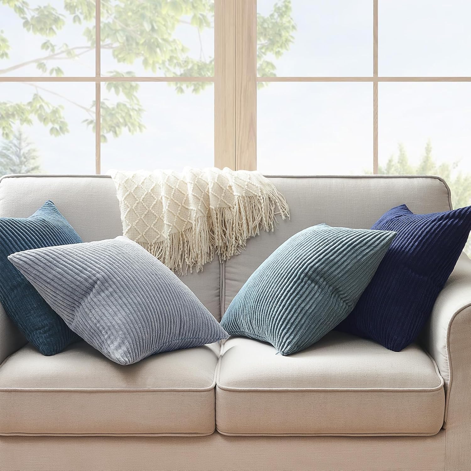
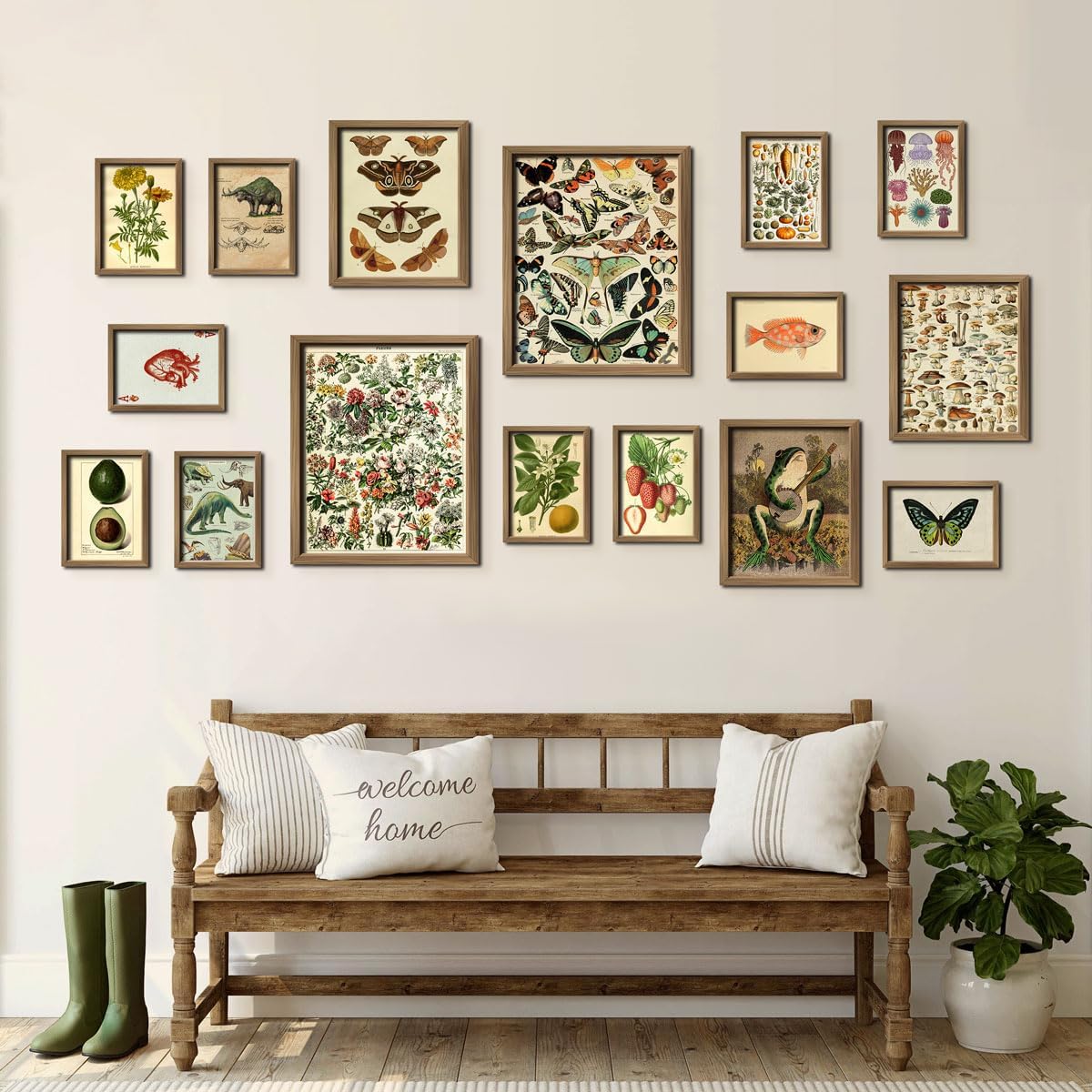
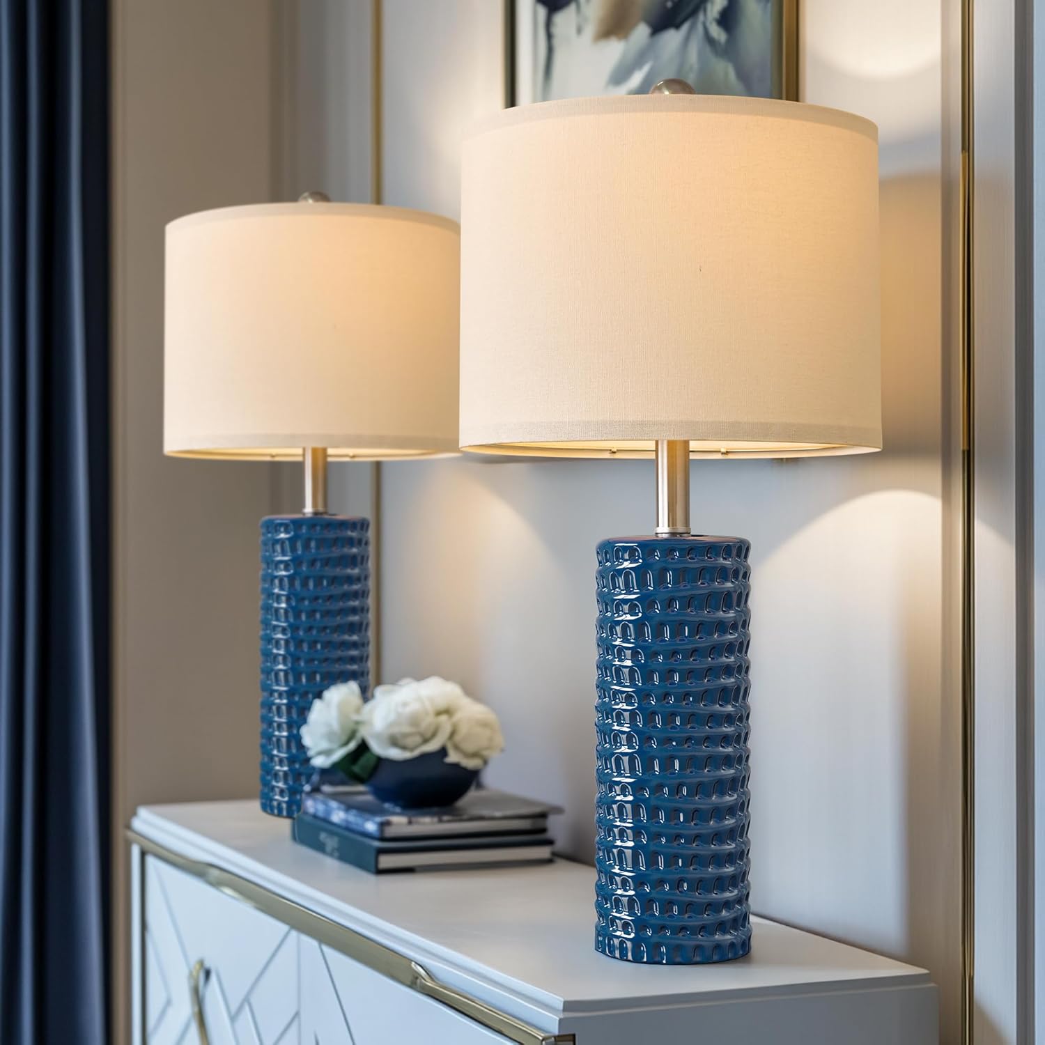
You don’t need to transform your entire space overnight. Start with removable elements like throw pillows, artwork, and accessories available on Amazon:
- Decorative Throw Pillow Set in Modern Colors
- Contemporary Wall Art Collection
- Modern Table Lamps with Colored Shades
Seasonal Color Adaptations
Modern living room color palettes can evolve with the seasons through strategic accessory changes:
Spring/Summer: Lighter textiles, fresh flowers, brighter accent pieces Fall/Winter: Richer textures, deeper accent colors, warmer lighting
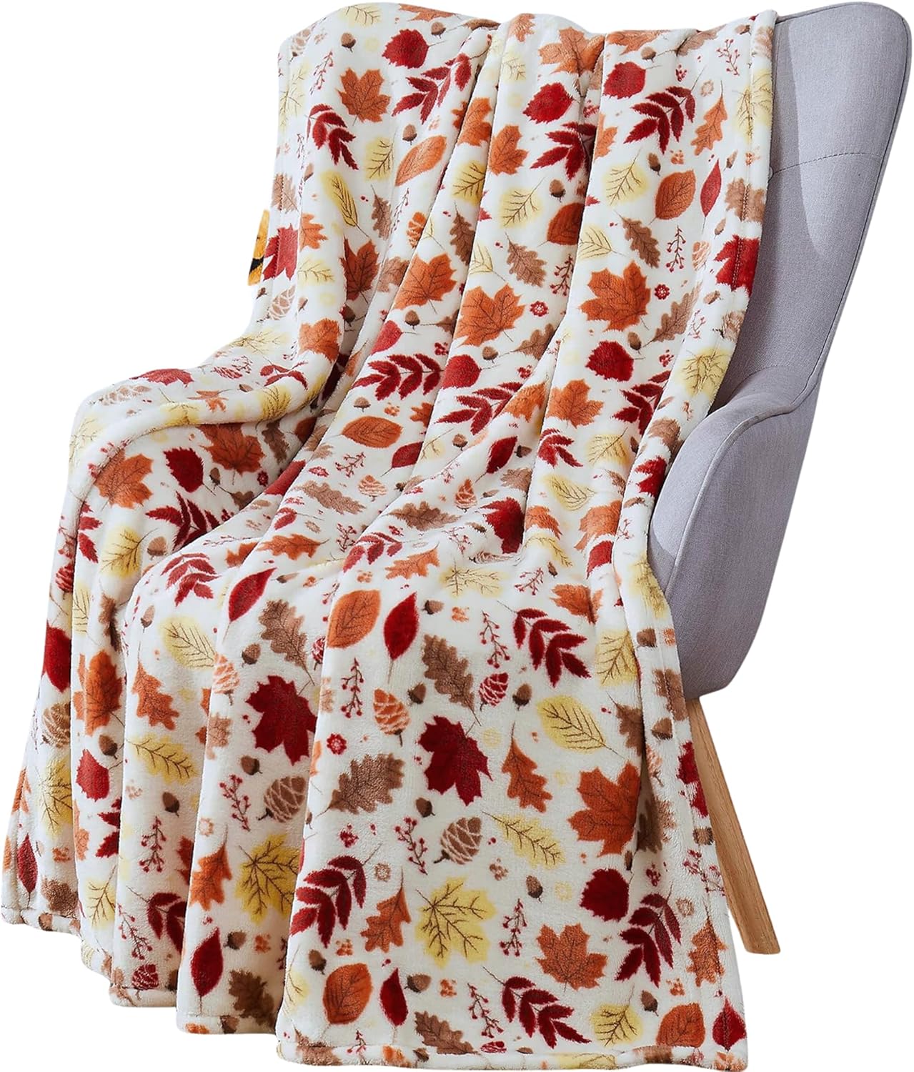
The Seasonal Throw Blanket Collection offers an easy way to refresh your color scheme without major changes.
Maintenance and Longevity Considerations
Color Durability
Some colors maintain their appeal longer than others. Neutral color palettes for living rooms typically offer the best longevity, while trendy colors may feel dated more quickly.
Touch-Up Strategies
Keep extra paint for inevitable touch-ups. Store paint in a cool, dry place and label containers with the room and date for easy identification.
Common Color Palette Mistakes to Avoid
Mistake 1: Ignoring Undertones
Every color has undertones that become apparent when used in large quantities. Test colors in your specific lighting conditions before committing.
Mistake 2: Matching Everything Perfectly
Overly coordinated rooms feel flat and uninspiring. Introduce subtle variations in shade and texture for visual interest.
Mistake 3: Forgetting About Scale
Large patterns and bold colors can overwhelm small spaces, while tiny patterns disappear in large rooms.
Technology and Color Selection
Modern color-selection apps can help visualize different modern living room color palettes in your space. Popular options include:
- Sherwin-Williams ColorSnap
- Benjamin Moore Color Portfolio
- Behr ColorSmart
These tools allow you to upload photos of your room and virtually “try on” different colors before purchasing paint.
Future-Proofing Your Color Choices
Timeless Elements
Incorporate classic elements that won’t date quickly:
- Quality neutral base colors
- Natural material accents
- Classic furniture silhouettes
Trendy Accents
Express current style through easily changeable elements:
- Throw pillows and blankets
- Artwork and decorative objects
- Seasonal plants and flowers
Conclusion
Selecting the perfect modern living room color palettes involves balancing personal preference, design principles, and practical considerations. Whether you gravitate toward sophisticated earthy neutrals living room palette schemes, bold jewel tone color palette modern living room designs, or the calming influence of sage green modern living room colors, success lies in thoughtful planning and quality execution.
The best color palette for your space depends on your unique circumstances—room size, lighting conditions, lifestyle needs, and personal taste. By understanding color psychology, following proven design principles, and gradually implementing changes, you can create a living room that feels both current and timeless.
Remember, modern living room color palettes should enhance your daily life, not complicate it. Choose colors that make you feel at home and reflect your personal style while considering long-term flexibility and appeal.
Start small, test thoroughly, and don’t be afraid to evolve your color scheme as your tastes and needs change. With the right approach, your living room can become a perfect reflection of modern style and personal comfort.
Frequently Asked Questions
Q: What are the most popular modern living room color palettes for 2025? A: The trending modern living room color palettes include earthy neutrals (beiges and warm grays), sage green schemes, sophisticated jewel tones, and muted metallic accents. These palettes balance contemporary appeal with timeless elegance.
Q: How do I choose between warm and cool color palettes? A: Consider your room’s natural light and intended mood. North-facing rooms benefit from warm palettes, while south-facing spaces can handle cool tones beautifully. Warm colors create intimacy, while cool colors promote relaxation and make spaces feel larger.
Q: Can I mix different color temperatures in one room? A: Yes! The most successful modern living room color palettes often combine warm and cool elements. Use the 60-30-10 rule: choose a dominant temperature for 60% of your palette, then add contrasting accents for visual interest.
Q: How often should I update my living room color palette? A: Base colors (walls, large furniture) can last 5-7 years, while accent colors should be refreshed every 2-3 years through accessories, artwork, and textiles to keep your space feeling current.
Q: What’s the difference between modern and contemporary color palettes? A: Modern palettes typically feature clean, sophisticated colors with minimal patterns, while contemporary schemes reflect current trends and may include more experimental color combinations and textures.
Q: Are dark colors appropriate for small living rooms? A: Yes, when used strategically! Dark accent walls can create depth and sophistication in small spaces. Balance dark colors with adequate lighting and lighter complementary shades.
Q: How do metallic accents work with modern color palettes? A: Muted metallic accents living room schemes add sophistication without overwhelming the space. Choose one metallic finish (brass, copper, or brushed nickel) and use it consistently throughout the room for cohesion.
Author Bio
Sarah Martinez, Interior Design Specialist Sarah is a certified interior designer with over 12 years of experience in residential design. She specializes in modern color theory and has helped over 500 homeowners create stunning living spaces. Sarah holds a Bachelor’s in Interior Design from the Art Institute and is a member of the American Society of Interior Designers (ASID). Her work has been featured in Better Homes & Gardens and House Beautiful magazines.
Connect with Sarah: [LinkedIn] | [Instagram: @sarahdesignsmodern]
Michael Chen, Color Psychology Expert Michael brings 8 years of research experience in environmental psychology and color theory to interior design. He holds a Master’s degree in Psychology from Stanford University and has published numerous studies on how color affects mood and behavior in living spaces. Michael consults with major paint manufacturers and design firms on color trend forecasting.
Areas of Expertise: Color psychology, trend analysis, sustainable design practices
Sources and References:
- National Association of Home Builders Trends Report 2025
- University of Rochester Color Psychology Research
- Sherwin-Williams Color Trend Analysis
- Benjamin Moore Design Statistics
- American Society of Interior Designers Market Research